Introduction
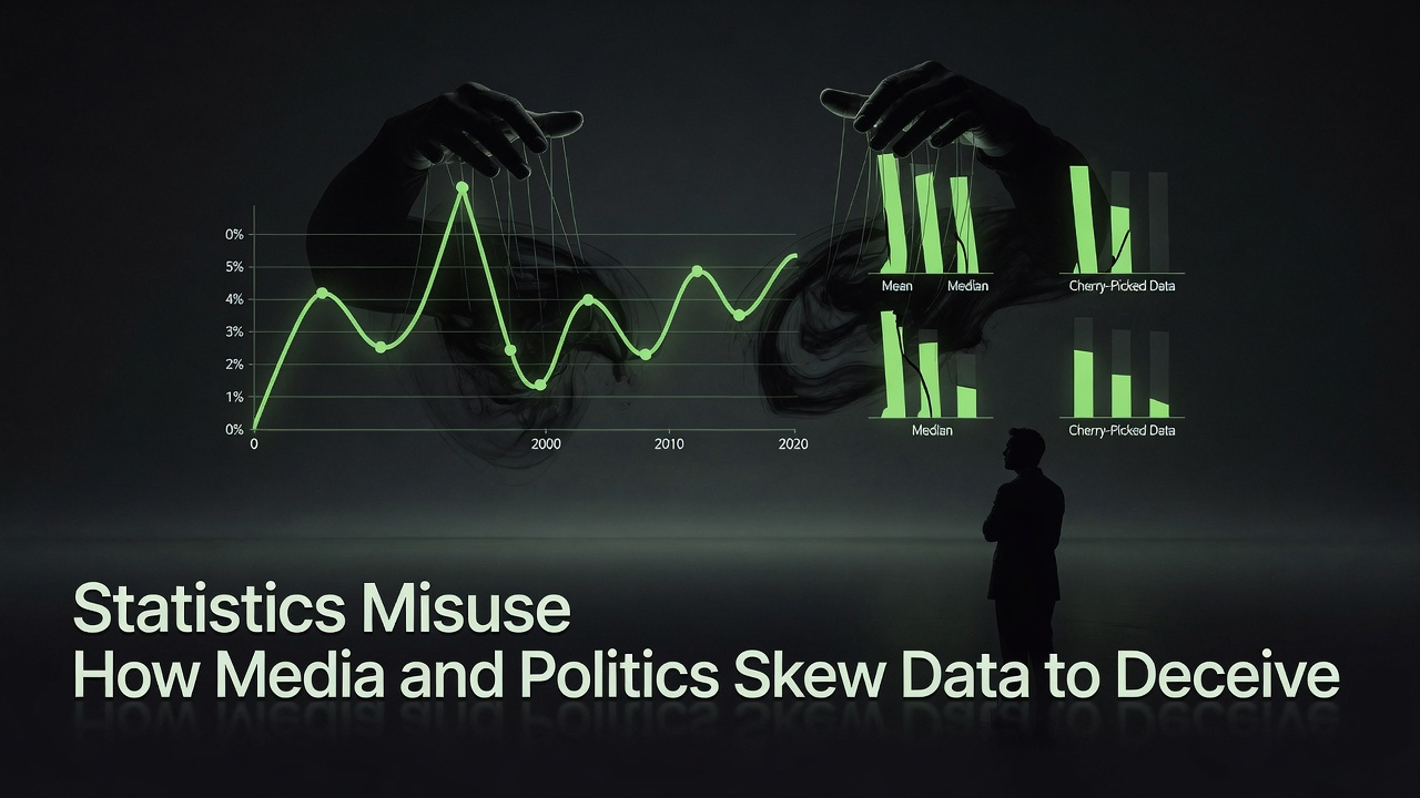
Statistics should inform public debate. Instead, media outlets and politicians frequently exploit them to advance agendas.[1] Confusion over basic measures — such as the difference between mean, median, and mode — creates openings for deception.[2] Selective reporting, omitted context, and visual tricks turn neutral numbers into persuasive weapons. This article examines proven techniques, real-world examples, and practical ways to spot manipulation without favoring any political side.
Common Techniques of Statistical Manipulation
Several recurring methods distort data while remaining technically accurate.[3] Cherry-picking selects favorable subsets while ignoring contradictory evidence. Changing the base period or comparison group alters apparent trends. Loaded polling questions or small, unrepresentative samples produce misleading results. Omitting key context — such as sample size, margins of error, or alternative explanations — leaves audiences with incomplete pictures.
These tactics appear across outlets and administrations. They exploit the public’s limited statistical literacy without fabricating numbers outright.
Selection Bias: When the Sample Itself Is the Deception
Selection bias occurs when the method of collecting data systematically favors certain outcomes or groups, making the sample unrepresentative of the larger population. The numbers may be accurate for the group that was actually measured, yet they are presented as if they describe everyone.
Media and politicians exploit this constantly.[2] Online polls suffer from self-selection bias — only people motivated enough to click participate, often those with strong opinions. Telephone surveys may over-sample landline owners or older demographics. “Man-on-the-street” interviews or social-media comment sections capture only the loudest voices. Crime or health studies that rely on volunteers attract people who are more engaged than average.
The result is a chart or headline that looks authoritative but rests on a skewed foundation. A poll showing “80 % support” may actually reflect only the 12 % of the population that bothered to answer. Always ask: Who was included? Who was left out? Would the results hold for a truly random, representative sample?
Mean vs. Median: A Favorite Trick in Economic Reporting
Income and wealth statistics offer the clearest illustration. The mean (arithmetic average) sums all values and divides by the count; it is highly sensitive to extreme outliers. The median is the middle value in an ordered list and resists skew. In highly unequal distributions, the mean can dramatically exceed the median.
Media reports on “average income” or “average wage growth” often cite the mean, making conditions appear better for typical households than they are.<a href=”#source-5”>[5]</a> Politicians similarly highlight whichever figure supports their narrative on inequality or economic success. The mode — the most frequent value — rarely appears in such debates because it adds little drama.
Classic and Recent Case Studies
Darrell Huff’s 1954 book How to Lie with Statistics catalogued many enduring tricks that remain relevant.<a href=”#source-9”>[9]</a> One modern example involved congressional testimony using a graph of Planned Parenthood funding versus cancer screenings that reversed the time axis to imply causation where none existed. Fact-checkers rated the presentation “Pants on Fire” false.<a href=”#source-4”>[4]</a>
Economic and crime data frequently face scrutiny. Claims of record-low unemployment under one administration or dramatic crime drops under another have prompted accusations of selective time frames or data reclassification. Voter-fraud or election-integrity statistics often rely on tiny samples or unverified anecdotes presented as systemic evidence. Each side accuses the other; the pattern persists regardless of who holds power.
The Role of Visuals and Graphs
Graphs amplify deception when y-axes are truncated or do not start at zero, exaggerating small changes.[1] Time periods are cherry-picked to hide reversals. Dual-axis charts compare unrelated scales to manufacture correlations. These visual sleights appear in campaign ads, cable news segments, and official briefings alike.
The Continuity Illusion: Journalists’ Delirious Love of the Connecting Line
One of the most seductive (and deceptive) tricks in modern data visualization is the humble line chart—especially when applied to discrete, annual, or categorical data. Journalists and YouTubers are absolutely delirious about them. A glowing, continuous line gliding across the screen creates instant drama: rising crime waves, plummeting safety, economic booms and busts. It feels like a story unfolding in real time.
But here’s the problem: a line chart strongly implies that the space between the data points is meaningful and continuous. It suggests smooth, gradual change even when none exists.
Take a recent YouTube video using a line chart of U.S. motor vehicle deaths by year (1999–2023).[8] The x-axis shows sparse year labels, and a bright white line connects the annual totals with dramatic peaks and valleys. Viewers see a “story” of steady decline, then a sudden crash and explosive recovery. In reality, each data point is a complete yearly total. There is no “mid-2007” death count, no linear slide from December 31 to January 1. The line fabricates continuity where the data is discrete. The same information would be far more honest as a bar chart (each year stands alone) or a step chart (the level stays flat for the full year, then jumps).
Always ask: Is the x-axis truly continuous and densely sampled? Or are we being sold a smooth story between unrelated yearly dots?
The Truncated or Non-Zero Baseline Deception
Even when the right chart type is chosen, the scale can still lie. Starting the y-axis at an arbitrary number (e.g., 40,000 instead of zero) makes modest 5–10 % changes look like explosive 50 % spikes. This is especially common in crime, unemployment, and economic charts on both sides of the political aisle. The numbers themselves remain accurate, but the visual impact is massively distorted.
Choosing the Wrong Chart Type
Beyond line charts, journalists frequently misuse pie charts with too many slices, 3D effects that distort proportions, or area charts where both height and width grow (doubling the perceived change). These choices prioritize drama over clarity and turn neutral data into persuasive theater.
Cherry-Picked Time Windows
A chart may show only the last five years to claim “record crime under X administration” while conveniently omitting the previous decade’s context. The data points are real, but the selected window hides the bigger picture. Always check: What happened before and after the highlighted period?
Chart Clutter and Information Overload
Too many lines, rainbow color palettes, tiny fonts, or overlapping series make a graph nearly impossible to read. Viewers quickly give up and accept the presenter’s spoken narrative. Clutter is often unintentional, but the effect is the same: the audience cannot verify the claim for themselves.
Ignoring Uncertainty: Missing Error Bars and Confidence Intervals
Polls, surveys, and small-sample studies almost never display margins of error or confidence intervals.[6] A 3 % difference in a poll with a ±4 % margin looks decisive on screen but is statistically meaningless. Without visual indicators of uncertainty, noisy or preliminary data is presented as rock-solid fact.
The Dark Figure: Ignoring the Dunkelziffer (Unreported Cases)
One of the most overlooked deceptions is pretending official statistics capture reality in full. The German term Dunkelziffer (literally “dark figure”) describes the vast number of crimes, incidents, or events that go unreported or unrecorded. For violent crime in the U.S., studies show only about 40 % of incidents are reported to police; for property crime the figure is even lower.<a href=”#source-7”>[7]</a> Charts of “official crime rates” therefore show only the visible tip of the iceberg.
Media outlets on every side routinely cite FBI or police statistics as definitive proof that “crime is down” or “crime is exploding”—without ever mentioning the hidden portion. When reporting rates change (due to distrust, fear, or policy shifts), the official numbers can move dramatically even if actual crime stays stable. Honest reporting would acknowledge this uncertainty instead of treating the charted line as the complete story.
Impacts on Public Opinion and Democracy
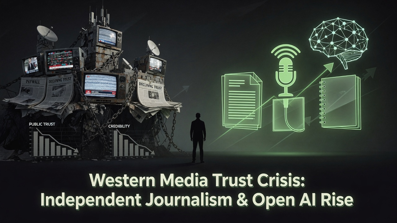
Repeated exposure to skewed statistics erodes trust in institutions and data itself.[6] Voters make decisions based on distorted pictures of inequality, crime, economic health, or policy effectiveness. Policy debates become polarized around competing narratives rather than shared facts. Over time, this weakens democratic accountability.
Key Takeaways
- Mean, median, and mode measure central tendency differently; confusing them enables selective storytelling, especially in skewed economic data.
- Cherry-picking, omitted context, and small samples are the most common manipulation tactics across media and politics.
- Truncated graphs and dual-axis charts visually exaggerate trends without falsifying numbers.
- Both legacy media and partisan outlets employ these methods; skepticism should be non-partisan.
- Critical consumers should always ask: Which measure of “average”? What is the full time frame? What data was excluded?
- Visuals can lie through inappropriate chart types, truncated scales, clutter, omitted uncertainty, cherry-picked periods, and by ignoring the Dunkelziffer—always verify the raw data and chart construction behind the pretty picture.
- Selection bias hides in the sampling method itself; always check who was actually measured and who was left out.
Conclusion
Statistics remain essential tools for understanding society. When media outlets or politicians misuse them — intentionally or through carelessness — they undermine informed citizenship. By recognizing the difference between mean and median, demanding full context, and scrutinizing visuals, the public can reclaim the power of numbers. Demand transparency from sources. Cross-check claims against primary data. Statistical literacy is no longer optional; it is a civic necessity.
Sources
- SAS Blog (2020). Don’t Be Misled: Exploring Statistics in the Media.
- StatisticsHowTo. Misleading Statistics Examples in Advertising and The News.
- UK Parliament (2023). How to Spot Spin and Inappropriate Use of Statistics.
- YIP Institute. The Misuse of Statistics in Politics: Abortion.
- Forbes (2017). How To (Spot A) Lie With Economic Statistics.
- Brookings Institution (2023). The Cost of Compromising Federal Data.
- Pew Research Center (2023). How Americans View Data Privacy.
- National Safety Council (2024). Motor Vehicle Fatality Data.
- Darrell Huff (1954). How to Lie with Statistics.
- Edward Tufte (2001). The Visual Display of Quantitative Information.
Comments
Comments are powered by Giscus (GitHub Discussions).
Enable functional cookies to load comments.